Introducing Multitasq

I’ve been working on this open source side project of mine for a bit, and I just submitted it to Mozilla Demo Studio, so I thought I’d make a quick post about it here. I wanted to take a tried and true design, the simple notebook-paper-stuck-on-your-fridge task list that you’ve probably seen other apps replicate, and completely reimagine it using the web and HTML5. The result still isn’t much more than a concept, but I think it’s a great example of something you can do with the web. And it’s enough to make me stop keeping track of my own tasks on paper at least.
Why another task list?
While trying to manage the tasks that I had to work on in programming projects using paper or sticky notes, it quickly became evident how well a tree structure fit this model of things I had to do. I have a couple of big projects I need to work on, and within each of those I have a bunch of things to build, and each time I try to work on one of those I wind up finding a whole mess of new stuff that needs to get done first.
That’s nothing new though, plenty of task programs and websites allow you to add subtasks (like Google Tasks). As I worked though, it still felt unnatural to me to move down a list. As I jumped from task to task, grinding away at a small detail of one then suddenly backing up working out the overall details of another, I found that what I was doing was more like traversing a tree.

This is the visualization that I’ve tried to replicate on paper or with existing mind mapping software for awhile now, but because I’ve never truly liked anything I used, I thought that I would take the opportunity to build something new from the ground up.
Goal 1: Scale
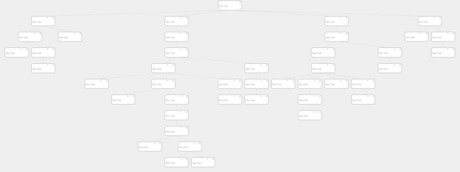
I wanted something that was useful even if you only wanted to remind yourself of a handful of points, but that could scale to also hold several huge software projects. This led me to SVG and the rescaling functionality, so that everything fits nicely on screen regardless of how many tasks you have going on, and the subtree deleting that allows you to work with lots of tasks at once.

Goal 2: Focus
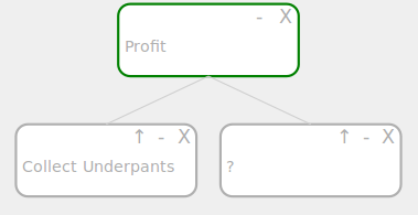
A huge scaled task tree lets you see the big picture of everything you have going on, but once you dive into a task, you really don’t care about a lot of the unrelated things on your list for awhile. This led two other features, minimize/maximize and up/down. The plus and minus buttons let you temporarily hide all subtrees, so that you can focus on what’s on top and not clutter the screen with details when they’re not needed. The up and down arrow buttons basically do the opposite. These let you bring a specific subtree to the top of the screen, hiding tasks above and letting you focus on the details that you’re working on.

Goal 3: Be Usable
Though I’m by no means a designer, I wanted to create a completely new user experience that was still very intuitive. I also wanted it to be usable on touch screen mobile devices, which lead to a lot of the click based interaction that you see. If you want to see the full list of all the UI commands and shortcuts, check the README on the github page.

Even though it’s a bit rough still, I’m happy with the current state of the project after starting from scratch. The latest stable build is up on multitasq.com, and I have a lot of plans for future development. Hopefully I’ll be able to add a backend to it and allow users to save tasks on the web.